Solved: New iPhone Control Center Is Too Cluttered


What to Know
- The iOS 18 update expanded the iPhone Control Center to multiple pages to fit more controls.
- Some users find the new Control Center too cluttered, but deleting unused controls can clean it right up.
The iOS Control Center is a valuable tool that gives you quick access to a wide variety of features from a centralized location. iOS 18 introduced a multi-page Control Center that automatically included popular controls. If you find the new Control Center too busy or difficult to navigate, we'll teach you how to tidy it up and delete pages easily.
How to Declutter Control Center on iPhone
It was always possible to customize the Control Center, but the iOS 18 update made it even easier to tailor to your specific needs. As soon as you update to iOS 18, you'll notice extra Control Center pages with brand-new controls. Once you've learned how to navigate and customize the new Control Center, here are some tips on decluttering it:
1. Delete Unused and Unnecessary Controls
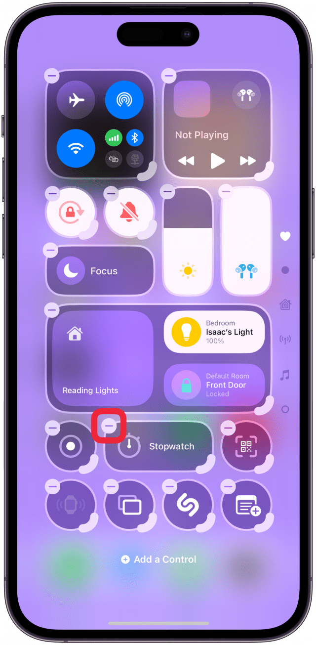
Deleting controls that you don't use is the best way to start decluttering. Think about what controls you will actually use in the Control Center. Doing this made me realize that I prefer to access many of the features in my Control Center in different ways, like using Siri to open apps or settings and even launch features.
So, if you use the Lock Screen to open the Camera app and Siri to control your smart home devices, you may want to remove these options from the Control Center. Don't forget that iOS 18 made it possible to replace the Flashlight and Camera icons on the Lock Screen and customize the Action Button in many new ways. You might realize that you prefer these options to using the Control Center.
2. Delete Entire Pages You Won’t Use
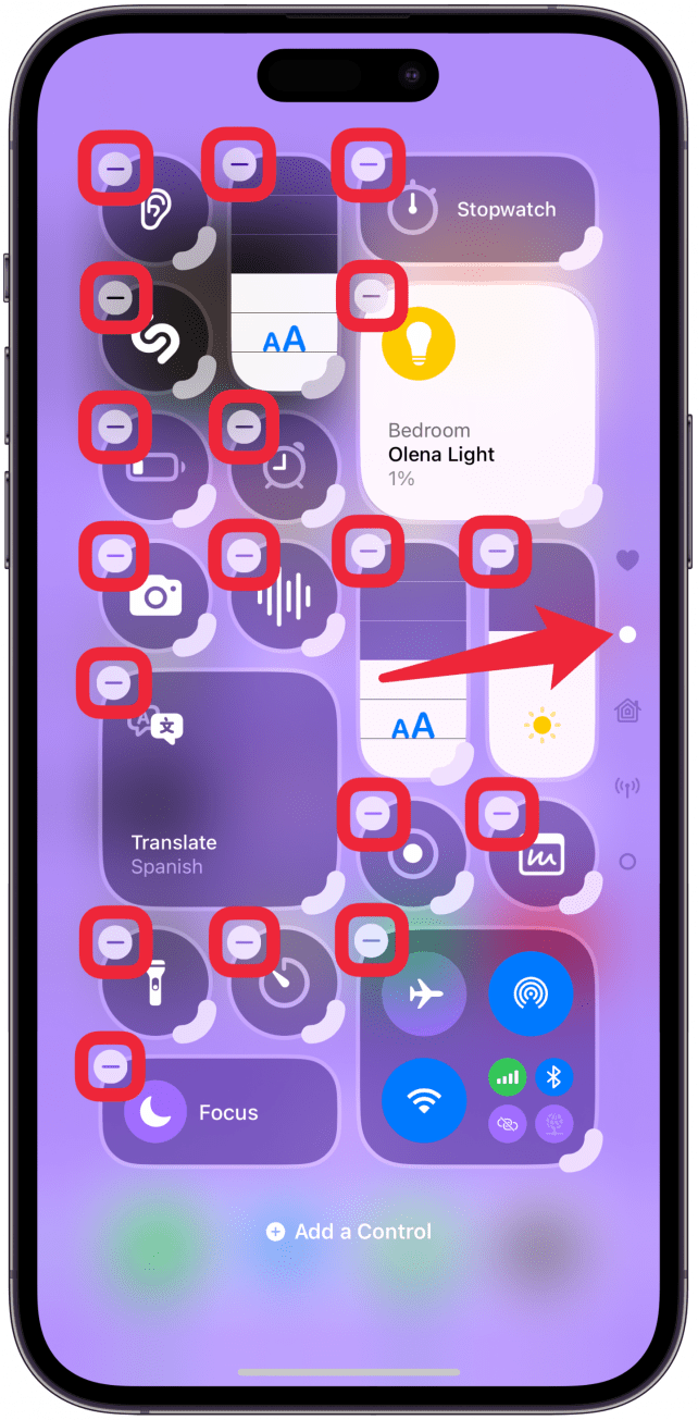
The Control Center can look overwhelming with all the new pages, and it is harder to navigate when you need to swipe to get to your desired control. Many users have also complained that their muscle memory doesn't work when navigating multiple pages, so they can't discreetly mute their iPhone or brighten their screen when it's too bright outside.
In order to delete a page, you’ll have to delete all the icons on it. Some users choose to only have one page with all their controls for a minimalist Control Center design. Others prefer to have several pages with larger controls that are easier to tap. The beauty of such a customizable iPhone is that you can always change your mind and re-add something you deleted.
Fun Fact
You may think that a multi-page Control Center is a brand new feature, but it was originally introduced with iOS 10 when the Control Center looked completely different. Not only did it appear at the bottom of your screen, but you had to swipe left and right to navigate between the different pages.
3. Consider Bundling or De-Bundling
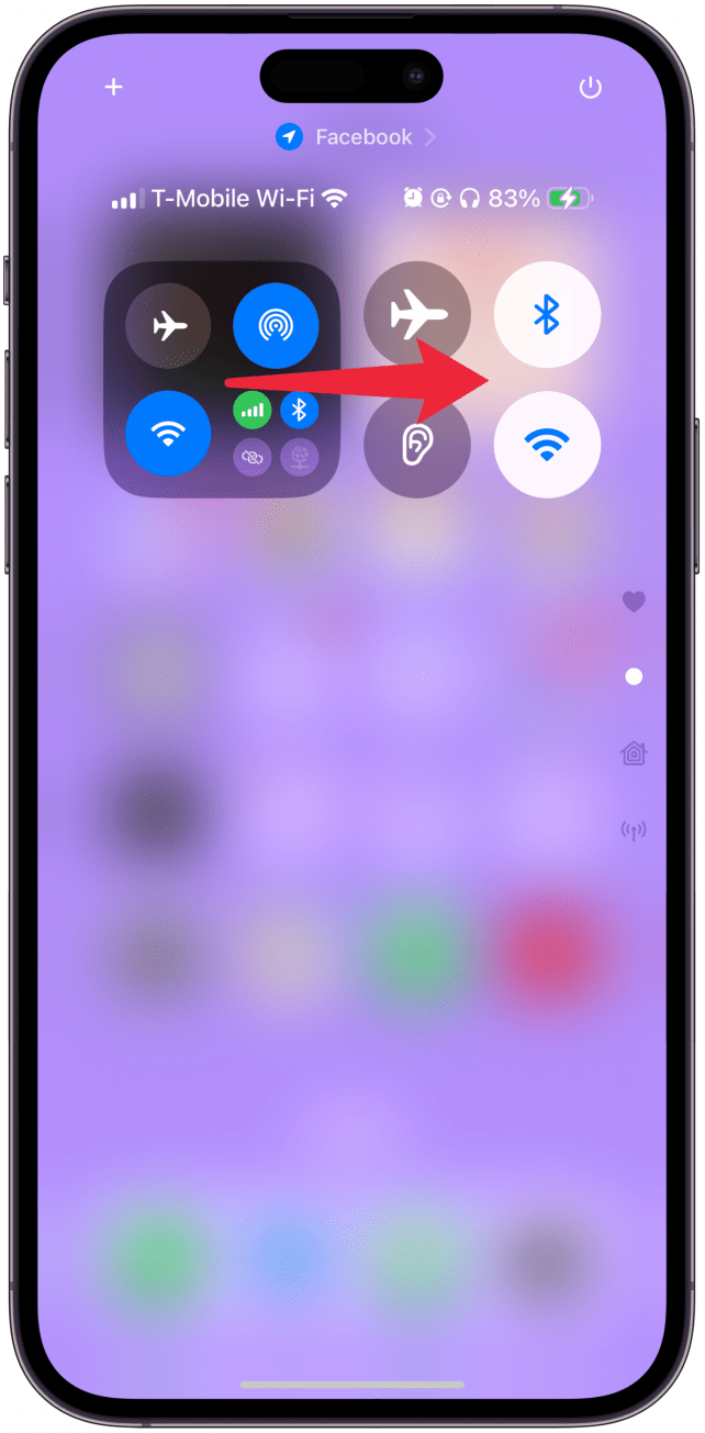
Some controls are automatically bundled, like Home and Connectivity, but you can delete the bundle and add the individual controls instead. For example, many users complain that it is harder to access Bluetooth because it is buried within the Connectivity bundle.
There are two solutions for this. One is to resize the bundle so you can access everything with a tap. The other is to delete the bundle and add the individual Bluetooth control instead. If you rarely use the Control Center to access your Hotspot, VPN, Satellite, or Cellular Data, you can just remove the bundle and replace it with the individual controls that you use the most.
With smart home controls, on the other hand, I prefer them bundled because they take up a lot less space that way. Personally, I turn on my smart devices using Siri, but I like to turn them off with a tap so I can do it when I'm away from home or in bed and don't want to disturb the peace. The Home bundle is good at showing you whatever device is currently on so that you don't have to dig around to find the device you are looking for to turn it off.
That being said, if you have lots of smart devices, having an entire page with the bundle or individual devices can be the best option for you. Decluttering is excellent, but if you have use for an extra page to display an expanded useful bundle of features, then it shouldn't be considered clutter. For more ideas on how to customize your iPhone, check out our free Tip of the Day newsletter.
4. Take Advantage of Resizing

When you are in edit mode, the bottom right corner of resizable icons will have a thicker lip that you can drag to resize the icon. Not every icon is resizable, and the size options vary for different controls. Since resizing Control Center icons is a new feature, I highly recommend playing around with them to see what your options are.
Having larger icons can make it easier for you to tap on them, but you won’t fit as many on one page. But if you often rely on muscle memory to navigate the Control Center, having larger icons might be best. But if you want to fit more onto one page, you’ll want to go as small as possible.
5. Add Gaps & Consider Spacing
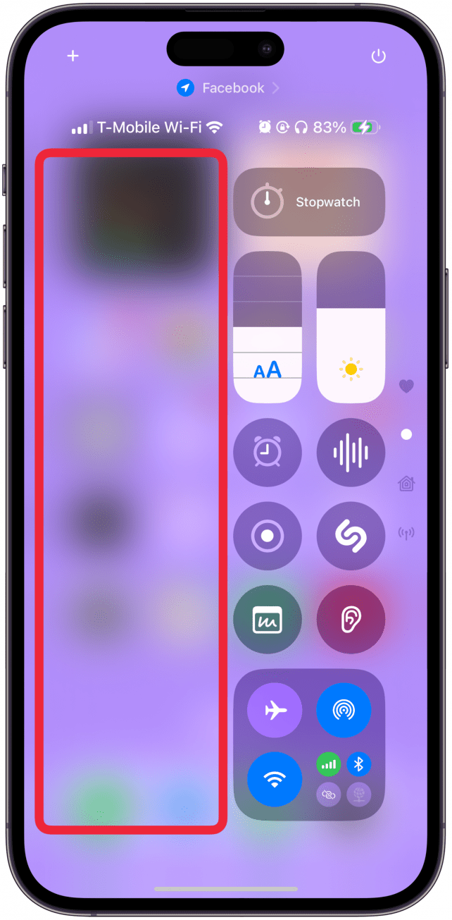
You can now position icons anywhere on the Control Center, leaving spaces between them if you wish—you are no longer held back by the snap grid. This can help you organize your Control Center in a convenient and aesthetically pleasing way.
If you're a one-handed thumb-tapper, consider putting your most used controls on the right side; you can even make a line of them, leaving the left side blank. It might take you some time to figure out what works best for you, but having these Control Center customization options is pretty life-changing.
I suggest revisiting your Control Center often to see if any changes would improve your experience. To return to the “old” Control Center, just delete everything on the pages that aren’t your Favorites, then pick and choose what stays and what goes. Make sure to check out the new Controls Gallery, because there are dozens of useful new controls that can finally be added to the Control Center, including many useful accessibility features.
Now you know how to declutter your Control Center and turn it into a practical navigation base for your iPhone. The perfect Control Center will look different for every user, so don’t be afraid to experiment and discover the best fit.
FAQ
- Where is Control Center on the iPhone? You can access the iPhone Control Center by swiping down from the top left corner of your screen.
- How can I remove Control Center from the Lock Screen? By default, anyone who finds your iPhone can access your Control Center without unlocking your phone first. You can change this by going to Settings, tapping Face ID & Passcode, and toggling off Control Center under Allow Access When Locked.
- What do the iPhone Control Center icons mean? Unlike the apps on your Home Screen, the icons in your Control Center don't show their name on the screen, so we created a simple Control Gallery icon guide that explains what every control does.
- Why can't I find a Control Center icon? Every icon is connected to an app. So, if you uninstall the app or your iPhone offloaded it due to inactivity, you won't see the icon as an option in your Control Gallery. You'll have to go to the App Store and reinstall the app, and the option will appear in your Control Gallery.

Olena Kagui
Olena Kagui is a Feature Writer at iPhone Life. In the last 10 years, she has been published in dozens of publications internationally and won an excellence award. Since joining iPhone Life in 2020, she has written how-to articles as well as complex guides about Apple products, software, and apps. Olena grew up using Macs and exploring all the latest tech. Her Maui home is the epitome of an Apple ecosystem, full of compatible smart gear to boot. Olena’s favorite device is the Apple Watch Ultra because it can survive all her adventures and travels, and even her furbabies.

 Olena Kagui
 Rhett Intriago

 Leanne Hays

 Amy Spitzfaden Both
 Rachel Needell