Meet the new generation of AirPods! On October 18, Apple announced the new AirPods (3rd generation) at its second fall event of 2021, 'Unleashed.' Even before their release, rumors abounded about AirPods 3; let's see which came true and which we'll have to do without.
News
Everything We Might See at the October 18 Apple Event
By Amy Spitzfaden Both
Apple announced its second event of the fall with a peppy graphic and the word "Unleashed!" While we didn't get any details beyond the time and place—October 18 at 10 a.m. PDT—there are a few significant releases we've been expecting for this year that we haven't yet seen. Most predominant among these are new MacBook Pros and perhaps a new generation of AirPods. Let's take a look at everything we might see on Monday.
Follow Our October 2021 Apple Event Coverage
By Erin MacPherson
Apple will hold a second fall event on October 18, when we hope we'll hear news of the products we didn't see in the September event, such as AirPods 3 and possible AirPods Pro 2, plus a new MacBook and maybe even a Mac mini. Our editorial team will be watching the Apple event live stream, and we'll post our in-depth coverage of the event in our Facebook group as we publish expert reviews and reactions to the things Apple reveals during the event. We'll also record a special podcast episode after the announcement, where we’ll discuss everything just announced. Read on to learn more about how to be a part of our event coverage.
October 2021 Apple Announcement: When & How to Watch
By Erin MacPherson
Apple's second fall event of 2021 will broadcast digitally Monday, October 18,
at 10 a.m. PDT. We may get confirmation of rumored new products we didn't see in the September event, such as AirPods 3 and possible AirPods Pro 2, plus a new MacBook and maybe even a Mac mini. Will this be the year to splurge on the hottest new MacBook? We'll bring you our expert analysis and reactions for everything announced at the event, so check out our Facebook page for event coverage and tune in to our post-event podcast to get the scoop!
MacBook Pro & MacBook Air Rumors: MagSafe chargers, Ports Galore & an Apple M1X Chip?
By August Garry
There have been rumors circulating about new MacBook Pros for a while now. Many of us were disappointed to see that they were not among the many announcements made at WWDC 2021. So, what can we expect from the new MacBook Pros? Will they be announced at the upcoming Apple event on September 14, 2021? And what about a new MacBook Air? Let’s dive into the rumors.
Apple's fall 2021 event, called "California Streaming," opened with a video montage that seemed designed to sell the audience on how beautiful California is. The montage then concluded with Tim Cook stepping onto a stage at Apple Park in Cupertino. Perhaps this is Tim Cook's way of trying to persuade remote Apple employees reluctant to give up working from home that it's time to return to the office? From there, Cook and the Apple team introduced a host of new products including the iPhone 13 lineup consisting of four new models, a ninth-generation iPad and sixth-generation iPad mini, and the Apple Watch Series 7 (but no Apple Watch SE update). Notably, no new AirPods were announced. While some of the new iPhone camera features are pretty exciting (Cinematic Mode, anyone?), there were no big surprises during the event. But even so, shiny new iPhones, iPads, and Apple Watches are always exciting. Here's everything you should know about Apple's latest devices.
iPhone 13 Rumors: What to Expect With the Next iPhone Release
By Amy Spitzfaden Both
Apple has announced its fall event, so on September 14 we're slated to meet the new iPhone. We're likely to see the iPhone 13 this fall, and there are some interesting theories as to what we might see, such as the return of Touch ID and a bigger battery. Here's everything we know about the iPhone 13, including a leaked rendering by MySmartPrice, what we might expect in terms of size, and some questions about the new camera placement.
Everything Apple Announced at the WWDC 2021 Keynote
By Sarah Kingsbury
Apple covered a lot of ground in its preview of iOS 15, watchOS 8, macOS 12, and iPadOS 15 during the second virtual WWDC keynote. The announcement was a bit scattered, as presenters covered an unwieldy range of topics from exciting FaceTime improvements, a contextual way to manage notifications and Do Not Disturb called Focus, and beefed-up privacy protections for everything from iCloud and Health to Siri and Safari. Some of the changes were expected, such as widgets for the iPad Home screen, while others, such as the ability to FaceTime with Android users, were not. Here's everything Apple announced today.
Will There Be Another Apple Event This Fall? New AirPods & MacBook Pros Could Still Be Announced in 2021
By August Garry
The Apple Event California Streaming came and went on September 14 without any word on new MacBook Pros, MacBook Airs, AirPods 3, or AirPods Pro 2. Might these devices and more be coming in an October or November Apple Event? We'll have to wait and see. While we wait, let's dive into rumors about what we can expect from these new devices, whenever they arrive.
Apple Announces the 9th-Generation iPad & 6th-Generation iPad Mini
By Cullen Thomas
Apple announced two updated iPads at its September 14 event in 2021. The two iPads are the iPad (9th generation) and a redesigned iPad mini (6th generation); we'll go over the features and pricing of both iPads, which seem optimized for video use, including features like increased brightness, better color with TrueTone, and also Center Stage, which allows the cameras to track your movement while you record a TikTok or a chat in a FaceTime Call. Let's get started.
iPadOS 15 Release: When to Update iPad & Which Features Are Available Now
By Erin MacPherson
Apple announced during its "California Streaming" event that iPadOS 15 is rolling out on September 20, but we've learned that some iPadOS 15 features won't be available yet. Delayed features are part and parcel with Apple's large annual software updates, so while we're not surprised to learn that we'll have to wait on certain functionalities, we're still a little bummed. When can you update, and which iPadOS features will be immediately available and which will be delayed? We'll walk you through it.
Every fall, Apple's events shake up the tech world with exciting product releases! This year, we expect several events, announcing a series of new iPhone 13, Apple Watch 7, AirPods 3, two new iPads, a new MacBook Pro, and maybe some brand new devices. Let's dive right in!
Follow Our iPhone 13 Event Coverage on September 14
By Leanne Hays
Apple will hold a fall event, called California Streaming, on the 14th of September at 10:00 a.m PDT. We'll finally find out if the rumors are true about the new iPhone 13 line, as well as other devices such as the Apple Watch 7, new AirPods Pro and AirPods 3, new iPad mini and iPad ninth generation, and a possible new MacBook Pro. Our team will be watching the Apple event livestream, and we'll host a conversation in our private Facebook group as the event happens; you're invited to join in, ask questions, and share your opinions. We'll tape a special podcast episode after the announcement, where we’ll discuss everything just announced. Read on to learn more about how to be a part of our event coverage.
When & How to Watch the Next Apple Announcement on April 20
By August Garry
On Tuesday, April 20, Apple will finally hold its 2021 event, Spring Loaded. We may get confirmation of rumored new products like AirTags, new iPads, an M1 iMac, and maybe even a new iPhone SE. Some dreams will be fulfilled, some crushed into the dirt. We'll cover all of it, offering commentary during the event in our Facebook group and in the special podcast episode we'll be recording right after. Here’s how you can watch Apple's April event too.
Follow Our October iPhone 12 Event Coverage
By Sarah Kingsbury
Apple will hold a second fall event on October 13, where we'll finally find out if the rumors are true about new, much delayed iPhone 12 line, as well as other devices such as Air Tags, a new HomePod, and more. Our editorial team will be watching the Apple event live stream, and we'll host a conversation in our private Facebook group as the event happens; you're invited to join in, ask questions, and share your opinions. We'll tape a special podcast episode after the announcement, where we’ll discuss everything just announced. Read on to learn more about how to be a part of our event coverage.
WatchOS 8 Focuses on Health Features, Lacks Major Changes
By Olena Kagui
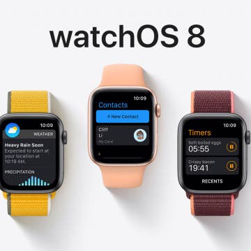
WatchOS 8 is coming to an Apple Watch near you this fall! This much-anticipated software update, announced at Apple's WWDC keynote event, was met with sighs at the focus on revamping the Breathe app. While the improved Health features come with exciting possibilities, the spattering of minor core features, including more flexible text writing, AirTags on the watch's Find My app, and a new Portrait watch face raise more questions than whoops of excitement. The watchOS 8 beta is available for those who want to try the new features now, while more cautious users can update to watchOS 8 in September when the finished version is released.
MacOS Monterey Blurs Line between iPad & Mac
By Amy Spitzfaden Both
Expect macOS Monterey to further blur the line between your Mac and your iPad. A new Universal Control feature Apple announced at its WWDC keynote allows you to control a Mac and iPad simultaneously using the same keyboard and mouse and drag and drop files easily between devices. Aside from opening up this hybrid work option, macOS includes new iOS 15 and iPadOS 15 features, like media sharing in FaceTime and notification controls tailored for different activities. Other macOS updates include redesigned tabs in Safari and an organization option called Tab Groups, which lets you sort your tabs into—you guessed it—groups that you can revisit later. And let's not forget that your Mac is now an AirPlay destination! The macOS Monterey beta is available for those who want to try the new features now, while more cautious users can update to macOS Monterey in September when the finished version is released.
iPadOS 15 Aims to Improve Multitasking
By August Garry
Though Apple's latest iPad Pro has an M1 chip and all the power to perform like an iMac, iPadOS is still no macOS. Apple announced new iPadOS 15 features at its WWDC keynote, including multitasking upgrades, widgets, an iPad App Library, improvements to the Notes app (including the new Quick Note), the Translate app on iPad, and updates to Swift Playgrounds. The iPadOS 15 beta is available for those who want to try the new features now, while more cautious users can update to iPadOS 15 in September when the finished version is released.
iOS 15: New Features, Updates, Release Date & Compatibility
By Leanne Hays
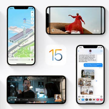
Apple previewed iOS 15 at the June 7 WWDC Keynote; the latest iPhone software update will integrate apps, features, and services, both new and familiar, more seamlessly than ever before. The iOS 15 beta is available for those who want to try the new features now, while more cautious users can update to iOS 15 in September when the finished version is released. These improvements will help iPhone users connect with friends and family, reclaim their time, and get more from apps that we've all grown comfortable and familiar with, like Photos, Wallet, and Maps. Let's go over everything we have to look forward to in the fall, including FaceTime updates, the new Focus feature and redesigned Notifications, the revamped Safari app, and much, much more.
The WWDC 2021 keynot on June 7 is less than a month away, and we are hoping to get some exciting news on iOS 15, iPadOS 15, macOS 12, watchOS 8, tvOS 15, and more. Apple's annual developers conference is all-online and free for the second year in a row. This event is a chance for Apple to showcase new software for its devices so that developers and system engineers can learn about changes for the year ahead. The event's highlight is the keynote announcement, which will stream live at 10 a.m. PDT on the 7th. Unlike the usual Apple announcements, the event focuses on software rather than new devices. This year, we expect to see UI upgrades on all the devices, new Apple Fitness Plus features, improved parental controls for Apple TV, and hopefully some new digital designs in the form of Apple Watch faces and screensavers.
