* This article is from our Tip of the Day newsletter. Sign Up. *
There are the apps we try and the apps we use. For the longest time, Day One sat on my iPhone as a wonderful journaling app I never used. Then iPhone Life magazine’s managing editor Rheanne Taylor showed me how she organizes her Day One journaling app. And in that moment, I realized I completely missed arguably the best feature this app has: the ability to create multiple journals. I’ll go more into her brilliant organization below. But with a simple change of outlook, the app has become more invaluable to me than any other note-taking, journaling, or markup app available. If you’re not familiar with Day One, then you’re really in for a treat. This journaling app is beautifully designed and works like a dream. I’ll go over more on what Day One does and why we love it below.
Related: Should You Buy the HomePod? We'll Tell You Everything You Need to Know

Day One (Free; Premium 3.99/month)
What It Does
Overall, Day One is a beautiful journaling app with more features than I’ll be able to cover in this article. The Premium version provides you with unlimited journals and unlimited photo storage for $3.99 a month or $34.99 a year. This is a new model for Day One, which used to be a single-purchase app. For Day One users who bought the app before this transition, there’s a lifetime discount. While a lot of users have not been happy about this change, I think it makes a lot of sense. Day One is planning to add lots of new amazing features. On its website, Day One lists three of these upcoming features: audio recording, writing prompts, and video entries. But in order to do that, the company needs a steady stream of money to invest back into the app. I think it’s worth the small investment for those who want and will use the best journaling app available for iPhone, iPad, and Mac. Which reminds me, with a premium subscription, you also get the Mac app. So all of your entries and writing will sync beautifully across all of your devices. Hoorah!
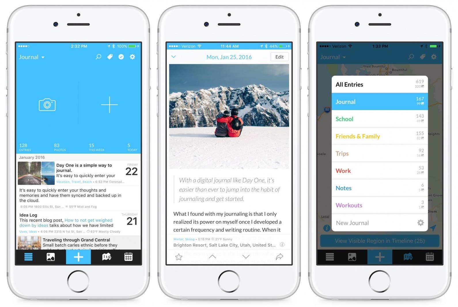
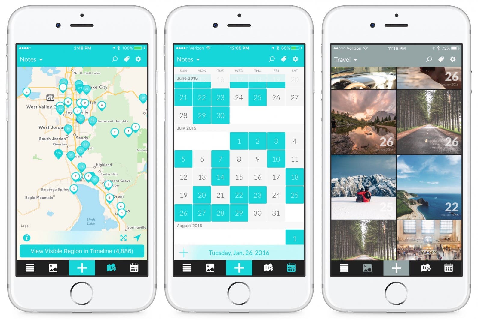
The Day One app provides you with four different ways to view your entries: the main Journals view, by photos, on a map, or via the calendar. The main view is where you can quickly start a new journal entry and see a preview of previous entries. The Photos view shows all the photos you’ve added to entries, and you can tap on a photo to view the full entry. The Map view lets you see where you were when you wrote the various entries, and the Calendar view lets you see when you wrote each entry. You can create tags to easily organize notes across journals, search by year, or even song. You can see what you wrote On This Day the year before or even set reminders to journal for certain days of the week or at the beginning and end of a month.
Why We Love It
My Day One journaling app is password protected, which makes it feel like more of a sacred, private place to pour my feelings into than a physical journal or computer document. As I mentioned in the first paragraph, Rheanne completely changed the way I organized my Day One app. Being able to create multiple journals, I just assumed I’d have one for each year. But no, Rheanne had a way better idea. She creates different journals for different reasons. So she has one for keeping quotes, one for daily free writing, one for lists, and on. I found this to be absolutely brilliant. Now I have six different journals, all of which I use under different circumstances. If I come across a recipe on Instagram that I really want to try, I add it to my Recipes to Try entry within my Lists journal. And since I can color-code my journals differently, I can visually see which journal I’m in very quickly.
There are many more features I can’t possibly cover here; but if you want a journaling app that’s elegant and wonderful to use, give Day One a try. While the shift to a subscription model has turned some users away, I think we as app consumers need to get used to paying for the features we want, just like we would with a physical product. And Day One is definitely worth it.

